RIDE | Perfecting the CTA bus ride experience.
The City of Chicago has a network of public buses, and they currently list the expected bus schedules on their website and at each bus stop. However, as any bus rider knows, expected bus times are rarely accurate due to traffic, extended stops for passengers with accessibility needs, or maintenance issues. A citywide survey revealed a clear need for a mobile app that would give Chicago citizens real-time transit updates to improve their experience.
Project Type
Mobile App Design
My Role
UX Designer
UI Designer
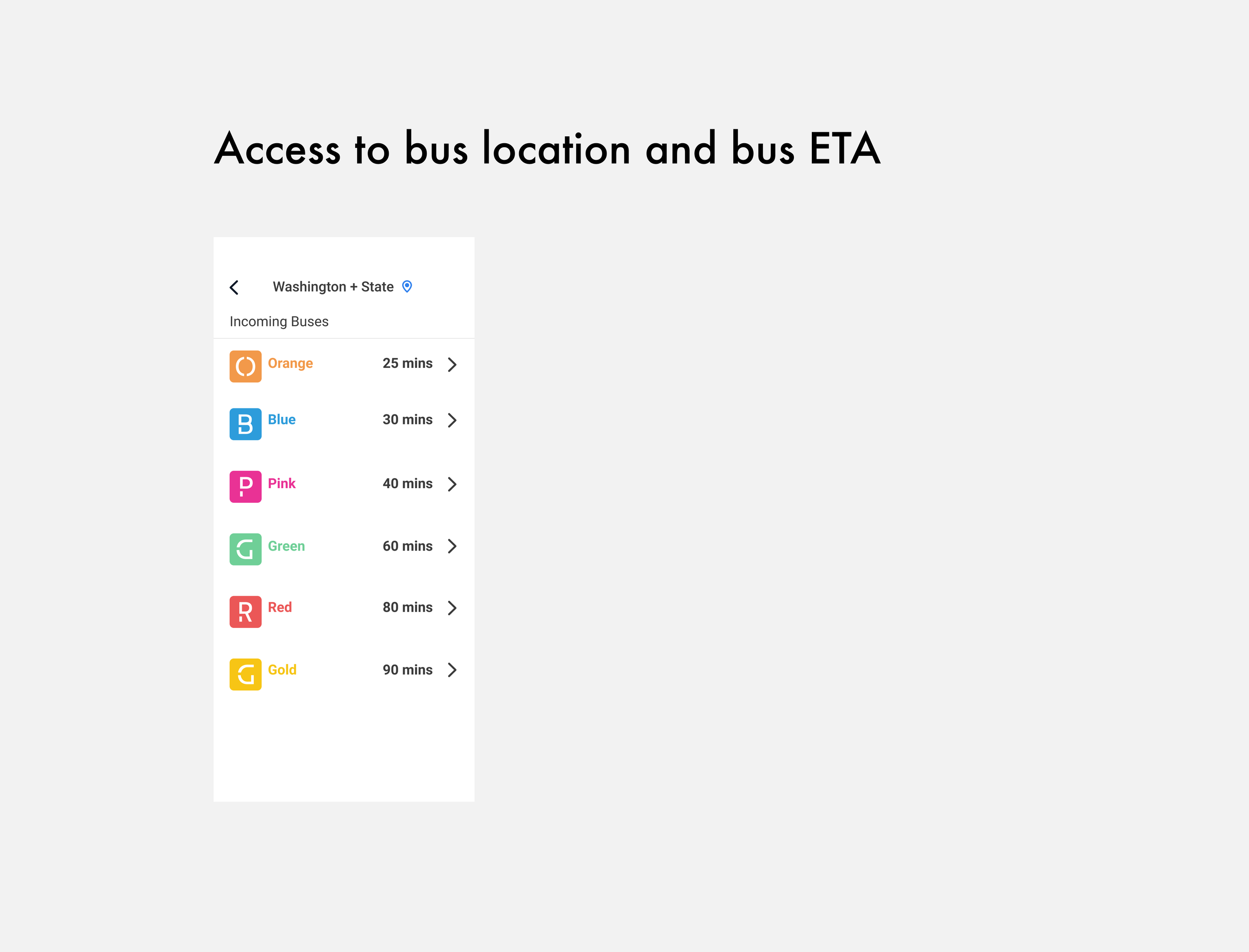
Ensure any rider can tell when buses will arrive at the Washington & State bus stop.
Help riders know how much time they have to get to the bus stop.
Allow riders to select one of seven bus lines and view upcoming arrival times at the stop.
The Challenge
Process and Timeline
Research and Discovery
I conducted a survey with 25 respondents to understand what riders needed from a bus app. The goal was to uncover their frustrations, what features they value, and why they might switch from using native apps like Google or Apple Maps. The feedback helped me identify five key features users wanted to see in the Ride app:
Real-time updates on bus schedules and delays.
Live bus location tracking.
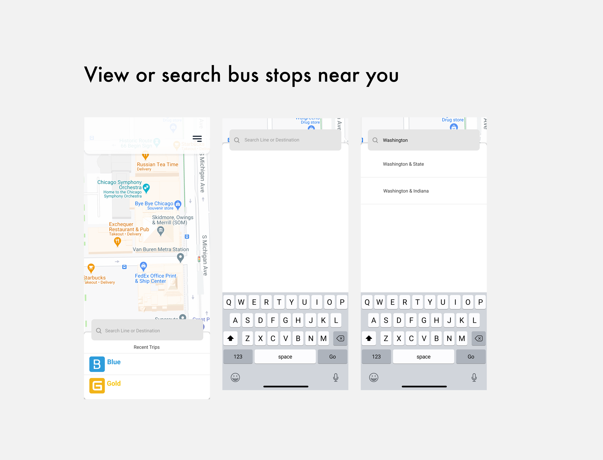
Easy access to bus stops near their current location.
Directions to the nearest bus stop.
A comprehensive list of bus lines at each stop.
User Survey
The survey confirmed that real-time information was a top priority for users. Many were frustrated by delayed or inaccurate schedules and wanted better tracking of bus locations. I also discovered what they liked about existing apps and why some felt native apps like Google Maps didn’t fully meet their needs.
Key Takeaways
To ensure the Ride app stood out among transit apps, I analyzed Moovit and Transit, both popular options used by public transportation riders. My goal was to pinpoint their strengths and weaknesses and identify opportunities where the Ride app could provide a better user experience.
Competitive Analysis
Strengths: It offers a comprehensive feature set with real-time bus tracking, stop notifications, and service alerts. Moovit’s global reach and support for various modes of transportation (e.g., bikes, scooters) give it wide appeal.
Weaknesses: While it’s feature-rich, the app lacks intuitiveness— users often struggle to find key features like real-time updates and light/dark mode. The overwhelming number of features can make it feel cluttered, and core functions like route planning aren't immediately visible.
Opportunity for Ride: By focusing on simplicity and core functionalities (like real-time bus tracking and easy navigation), Ride can reduce complexity and improve ease of use for daily commuters.
Moovit
Strengths: Transit excels in visual design and ease of use, with a bright, engaging interface and a highly intuitive flow. Users can quickly access information, making it great for casual riders.
Weaknesses: However, its functionality feels too similar to Google Maps, which limits its appeal for users who already have access to free, native apps. Additionally, some riders mentioned Transit’s notifications are not always reliable, especially when there are bus delays.
Opportunity for Ride: Ride can differentiate itself by offering more reliable real-time notifications and an offline mode—helping users even when connectivity is an issue. Additionally, the Ride app can provide more specific local information, like tailored bus stop alerts, to better serve daily commuters.
Transit
Based on survey results, I created two key personas: one who relied on the bus as their main form of transportation and another who used it for leisure. These personas informed the design and helped ensure the app catered to both practical and casual users.
Understanding the User
With the user needs in mind, I created user stories and prioritized the most important ones to guide the app’s functionality.
Dirk - Commuter using the bus to get to work
HIGHEST
“I need to quickly find the bus route that takes me to my workplace.”
Dirk values efficiency and wants a straightforward way to find the right bus route without unnecessary steps or extra information. He’s focused on getting to work as fast as possible.HIGH
“I want to receive real-time notifications about any changes to the bus schedule.”
Staying updated on delays or changes in the schedule is critical for Dirk, so he can adjust his timing accordingly and avoid missing the bus.MEDIUM
“I need to know how long it will take me to get to the Washington & State bus stop.”
Although not as urgent as other tasks, knowing the time required to reach his bus stop helps Dirk plan his trips, especially during rush hour.
Emma - Leisure rider heading to the mall
HIGHEST:
“I want to easily find the bus route that takes me to my destination.”
Emma’s primary goal is to quickly figure out the best bus route to reach the mall without any confusion.HIGH:
“I need to look up the mall’s address and get bus route options.”
Emma values convenience, so being able to input her destination and get several route options ensures she can choose the one that fits her plans.MEDIUM:
“I want to get past onboarding quickly so I can start planning my trip.”
While onboarding is important, Emma prioritizes getting right into the app’s core functionality to plan her trip, which is why she prefers a streamlined onboarding process.
Information Architecture
Sitemap
To ensure the app's navigation was intuitive and aligned with user needs, I created a sitemap that outlines the app’s structure. This helped visualize how users would move through the app, from finding nearby bus stops to checking real-time bus schedules. The sitemap also served as a guide during the wireframing process, ensuring that the user journey remained simple and direct.
Sketches
I started with paper sketches to explore potential layouts and focus on key user stories. My main goal was simplicity and clarity—ensuring that users could easily find the information they needed.
Wireframe Ideation
Digital Wireframes
I translated these sketches into digital wireframes, prioritizing the features highlighted by the survey, such as live bus tracking and real-time schedule updates.
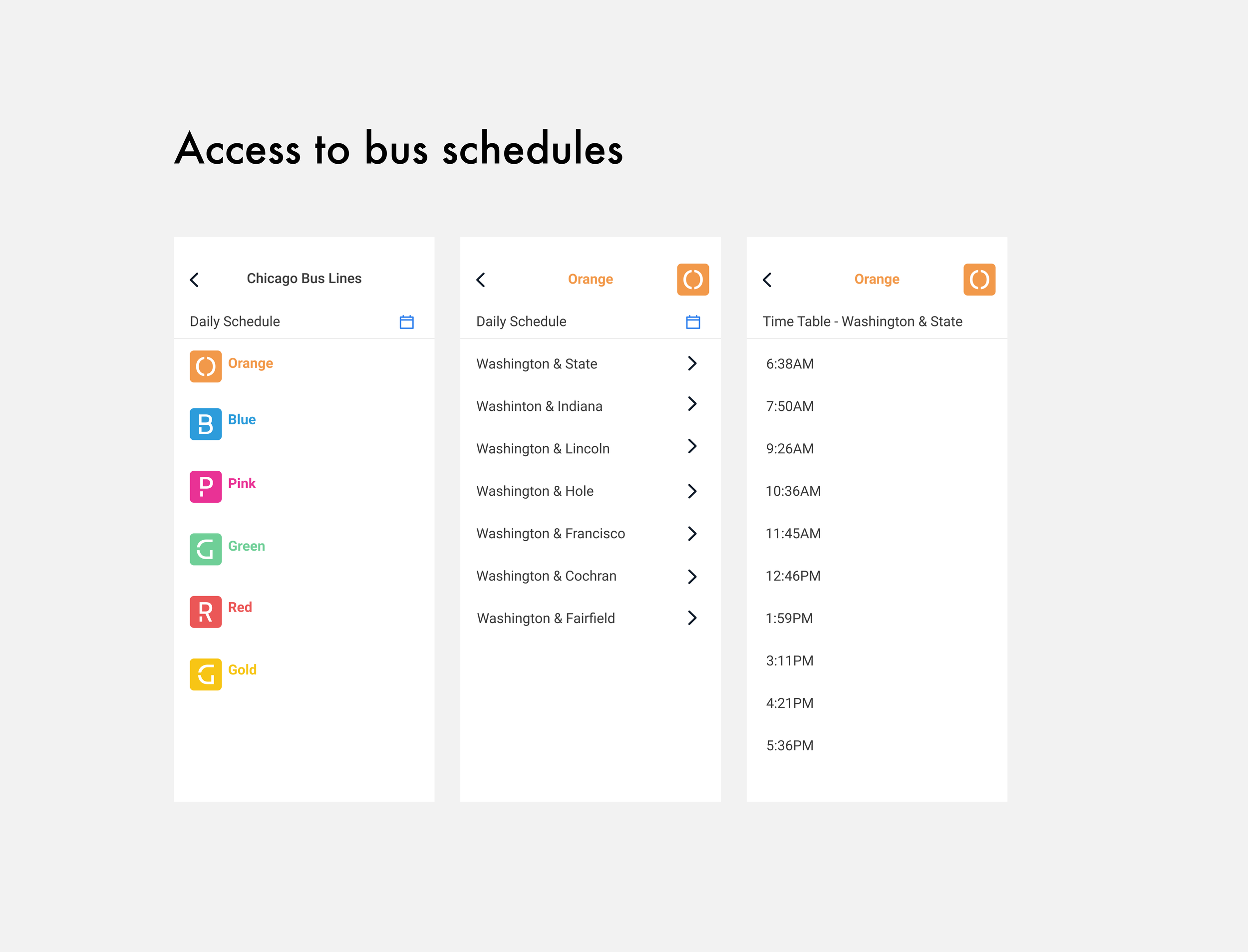
Daily Schedule
Riders can see the schedule for all seven bus lines passing through Washington & State.
The Results
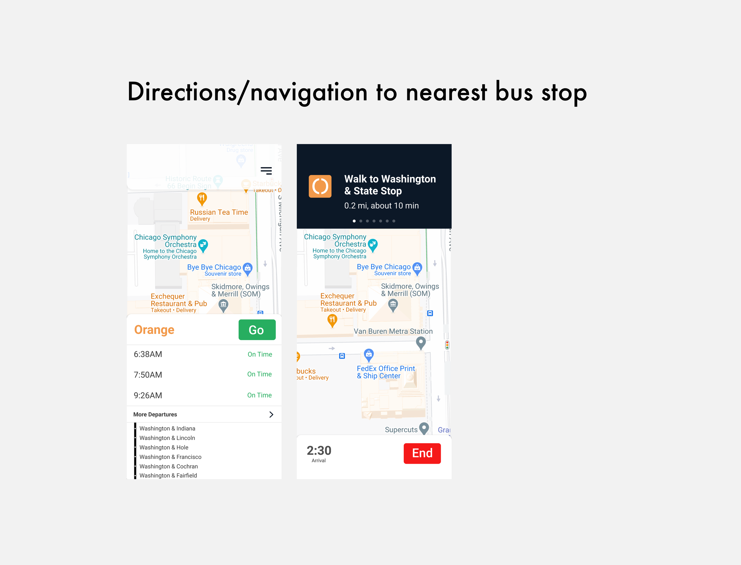
Navigation
The app provides step-by-step directions to the nearest bus stop.
Time Tables
Riders can view tentative schedules and adjust their plans based on real-time updates.
Visual Design
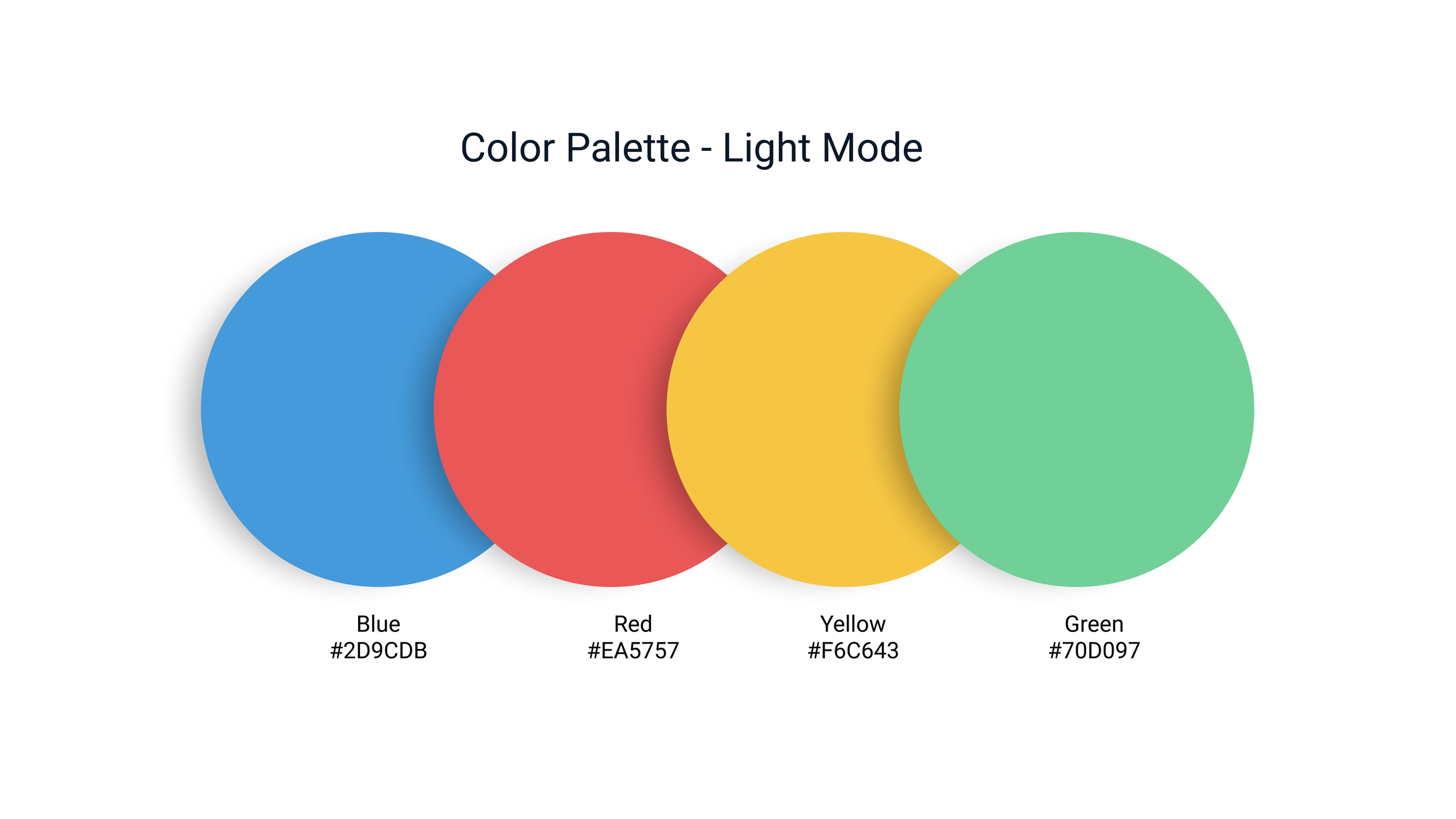
Brand Identity
Bright
Minimalistic
Fun
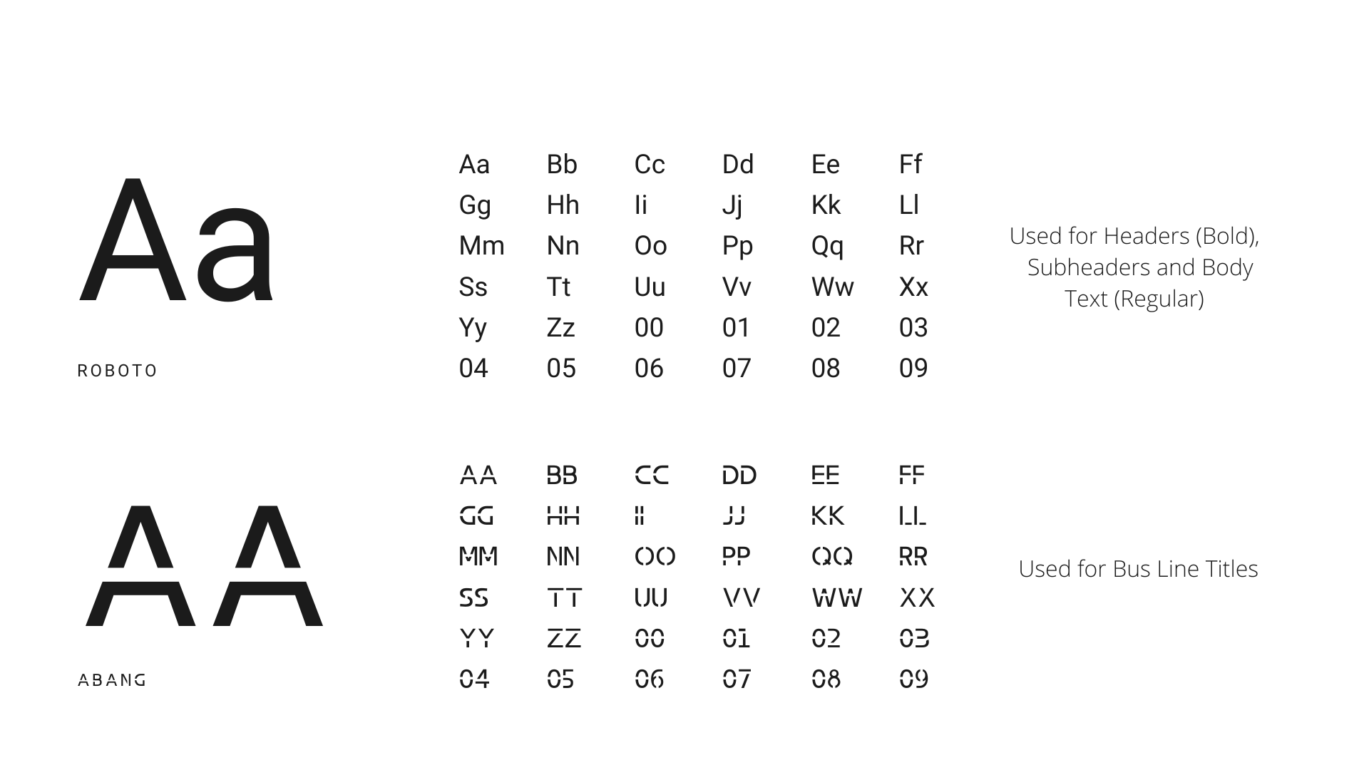
Typography
Prototype and Testing
I conducted usability tests with six participants, focusing on whether users could:
Find the nearest bus stop.
Identify which bus they needed.
Access real-time arrival information.
Changes Made After Testing
Incoming Buses
Users wanted to quickly view all available bus lines at their chosen stop. Based on their feedback, I added an option in the menu tab where users could select individual bus lines and view schedules. I also replaced the text-based details link with a more intuitive arrow icon to improve usability.
Bus Route Schedule
Users expressed a desire to see which specific stops each bus line serviced. To address this, I added a detailed screen that allows users to select a stop and view the upcoming arrival times for each bus line.
Offline Map
Some users were concerned about losing connectivity during their commute. To accommodate this, I introduced an offline map feature that allows users to download a map and access the bus schedule even without an internet connection.
Bus Time Table
Users also emphasized the importance of a timetable feature that would allow them to plan their trips around specific arrival and departure times. In response, I added a timetable feature, enabling users to view exact times for each bus line at each stop, further improving the app's reliability for trip planning.
This project taught me the importance of viewing the design process holistically. Although the business objectives were clear, understanding the users’ needs allowed me to create a product that truly worked for them. I also learned how to effectively conduct usability tests, which were crucial in refining the app based on real-world feedback. In the end, I gained valuable insights into balancing user experience with business goals, and how to iterate on a product based on continuous feedback.
If I had more time, I would add a clickable map feature, allowing users to zoom in and explore bus stops nearby, as well as conduct additional usability tests for further improvements.


